Color Schemes
How Artists and Designers Use Them
A WebQuest for Studio Art

analogous color scheme Wheat Field Under Clouded Sky Vincent Van Gogh
Do you always take what you see at face value?
Have you ever seen a work of art or an advertisement that gave you a powerful reaction?
Besides the subject matter protrayed, artists and designers have other tricks for grabbing you emotionally.
Discover one of these techniques and learn how you can use it in your own artwork.
Today you're going to work with a partner to discover how artists and designers use combinations of colors, called color schemes,
to create or enhance feelings in the viewer.
At the end of the lesson you'll be able to tell the names of four different color schemes
and the feelings associated with them.
You'll also be able to analyze artwork and advetisements
and tell which color scheme was used in its creation.
After you have completed today's lesson you'll select one of the color schemes to use in a painting of your own.
There are lots of activities to do, and fun things to try, so...

First, let's see what you remember about some basic color theory.
Click on this flash card link to review and test yourself on what you know.
How did you do? Is it all coming back?
If at any time you get confused about the terms covered in the flash cards, just go back and look them up again.
Here is a copy of the color wheel for you to refer to as you learn about color schemes.
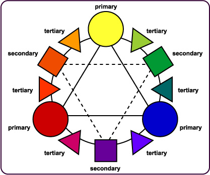
Color Wheel from The Artist's Toolkit
When we talk about color schemes, we're talking about combinations of colors.
Using the color schemes deliberately in your artwork will enhance the message or feelings you are trying to convey.
Keep in mind that when we're talking about these color combinations
we mean that the colors in the scheme may not be the ONLY colors the artist or designer used,
but they will be the DOMINANT ones.
The four color schemes in this lesson are:
MONOCHROMATIC
Any color with or without any of its shades and tints (mixed with black or white).
This tends to have a calming effect on the viewer.
see examples of the monochromatic color scheme
COMPLEMENTARY
Two colors that lie directly across the color wheel from one another.
Creates strong visual impact. Exciting!
see examples of the complementary color scheme
ANALOGOUS
Colors that lie next to one another on the color wheel.
Very harmonious.
see examples of the analogous color scheme
TRIADIC
Three colors that are equidistant (equally spaced) from one another on the color wheel.
Examples would be the primaries or secondaries or any three colors that are 120° from each another.
The artist or designer can use these to create a feeling of balance and formality.
see examples of the triadic color scheme
Now you can test your learning by clicking on the link below.
If you get less than 70%, come back and look at the examples above one more time.
Color Scheme Self Test
How did you do? Think you've got it?
Then try using the color schemes you've learned to make pictures at this National Gallery of Art site.
Experiment with the dot function and symmetry tools to create some manadalas (radial designs) using monochromatic, complementary, analogous and triadic color schemes.
It's time to take a quiz for me to grade.
You'll be analyzing 10 artworks and advertisements to determine the color scheme and tell the feeling associated with it.
Please do this individually.
If you don't have a hard copy of the analysis form, click on the link below and print one out.
Color Scheme Analysis Form
When you have the analysis form, go to the Artworks webpage and begin.
Artworks

You are in the driver's seat!
Now you have the knowledge to create artwork with maximum impact!
Good work!
Credits:
Created Spring 2007 for ETAP 623, SUNY Albany, Chia-Huan Ho, Ph.D. professor
Gagne, R.M., Wager, W.W., Golas, K.C., Keller, J.M. (2005). Principles of Instructional Design, 5th ed. U.S.: Wadsworth Publishing.
http://www.images.google.com
Lauer, D.A. and Pentak, S. (1999). Design Basics, 5th ed. U.K.:Wadsworth Publishing.
Shambaugh, R.N. and Magliaro, S. G. (1997). Mastering the Possibilities. Boston: Allyn and Bacon.