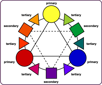
For example, red and green or red-orange and blue-violet.
The strong contrast in this color scheme really grabs the viewer's attention.
It creates a feeling of excitement and anticipation.
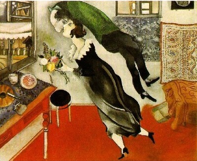
Birthday Marc Chagall

Southwest Airlines Spirit 1 ad
The red and green and oranges and blues of these two examples are very exciting.
This color scheme is definitely NOT harmonious.
Placing the complementaries directly next to one another has the strongest impact.